Big impact from L.E.D. usage completing designing job for URBAN Karaoke. It's whole concept designed by Fcendvsyu design team, guided by it's owner Mr. Solih Toha. This family karaoke owner is a success entrepreneur that also owned a famous restraunt in Plaza Damas named Daun Cafe.
Urban Karaoke is also located at Plaza Damas which was the previous Daun's place, now Daun Cafe had moved to a better location also in Plaza Damas.
Above is the earliest layout plan in 3 dimensional view for Urban, however minor changes done by Mr. Solih and fcendvsyu design team after measuring exact on the site. All changes done purposely after considering all possibilities and space usage. Below was the front facade of Urban at Plaza Damas.
Playing with minimal basic colors such as warm grey for the interior suggested by fcendvsyu design team for Urban's receptionist and waiting area. Adding colors only using L.E.D.s playing with electra blue.
The 4 feet pathway early design below suggested by our team was a little bit too much.
Reducing the design will help reducing the time frame for completing this karaoke and also reducing the cost. Below is the final 3 dimensional illustration view with straight L.E.D. strips at the plaster ceiling.
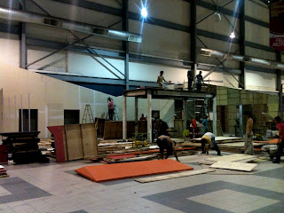
Below pictures show the progress work, as you can see the tiles are 2x2 foot side by side polished finish choose by the owner himself. It is a good choice because technically saves a lot of construction time when cutting the tiles is unnecessary.
The VIP room for Urban is so spacious. The above 3 Dimensional illustration was slightly change, a big projector screen added between those 52 inch led tv.
The ceiling that we design was greatly done by the contractors exactly as the illustration.
This is the wall looks before the signage was installed.
Urban Karaoke is still under construction and will be operating soon by next month. Bring your family to Urban Karaoke at Plaza Damas Kuala Lumpur, this karaoke offers a great sing along experience with high quality sound system from JBL. Thanks for the new followers of Fcendvsyu Design and also thanks for all our client out there! Untill we meet again. Bye
Read more...
.JPG)

.JPG)
.JPG)
.JPG)
.JPG)
.JPG)
.JPG)
.JPG)
.JPG)
.JPG)
.JPG)


