From our original design plan, we combine red, green and gold, and play with stripes in red. The space given to build this pavilion is 18 x 12 meters. So we start doing design and hopefully this large space will become great impact.
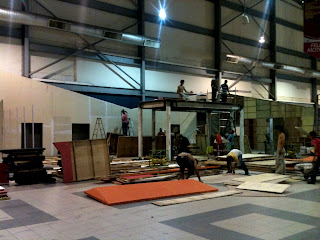
Starting from 12.00 in the afternoon, they started standing this pavilion. However this metal structure was built separately earlier and only assembling job were done at this site. This is the same metal structure that been use for concrete buildings. It is to ensure this deck will stand strongly with more than 20 people on top of it.
After twelve hours of working, this pavilion stands almost complete.
To ensure the color match with the design was not an easy job. The first paint layer was not exactly the same as in the design, but our technical manager says the color will be exactly the same after 3 layers of paint finished and dry. So we wait and see after all layers were applied, and when it dry it really become as the same as in the design.
Finally this pavilion done in 24 hours!
The stairs with green and red lining carpet.
At the top of the deck where a cafe style with seating arranged. We use an artificial grass carpet for this area.
This double deck setting pavilion is became a big attention to all visitor at this event. Especially photographers that searching for different perspective from higher side of view. This design is quite tricky to build, but as a designer we are having fun solving all the problems until it can stand. Thanks again to all viewers of Fcendvsyu design blog! Hello to 2013! wishing this year will gain a lot more satisfaction in designing! Bye!
Read more...


